
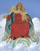
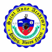
CHRIST is the reason and the center of Catholic education and evangelization. That is why the “Chiro” monogram of Jesus Christ is found at the center and upper most part of the coat of arms. The uppermost section of the logo is also dominated by a “book” which symbolizes the HOLY BIBLE. The writings on it read this way “I am the Way, the Truth and the Life!” It is the source of evangelization and catechesis which is the primary reason of catholic education. On the right side is the EUCHARIST, the “source and summit of Christian life and worship.” At the center is a picture of Saint Anne as she is enshrined in the main altar of the Catholic Church of Piddig.
The lowermost section is dominated by two cultural symbols: the harp on the left and the “burnay” earthen vessels on the right. The harp is a reminder of the cultural riches of Piddig, where Saint Anne Academy is located. The harp reminds the young people of the talents of their forefathers - one Claro Caluya, musician and composer of Ilocano ballads. The “burnay” (a container where local wine called basi, made of sugarcane is kept) reminds the young people of the bravery of the Piddigueños during the Basi Revolt.
The Latin transcriptions read: A.D. 1965 is the date when the school was founded “in the year of the Lord two thousand and sixty five.” Pro Deo Focis et Patria means for God and country. This is taken from the vision-mission of the school.
The colors: BLUE stands for the Blessed Mother and RED for Saint Anne. YELLOW is the color commonly associated with the Roman Catholic Church.


Hi! I'm a contributor for www.wikipilipinas.org. I am wondering if you can grant us permission to include your school logo for my entry about Claro Caluya. Please let me know soon. Thanks!
ReplyDelete